Whether your goal is to increase brand awareness or to sell a product or service, effective website design can be the difference between a new conversion and a lost prospect. Your website is how users learn what your brand is all about. The last thing you want is for a poorly designed website to dissuade site visitors from becoming customers. Follow these 11 tips for effective website design and you should start seeing more conversions in no time:
Elements of Effective Website Design
1. Less is more
When it comes to effective website design, the simpler the better!
The Paradox of Choice dictates that the more options you give people, the easier it is for them to choose nothing at all. In the case of web design, this has never been more true. Having too many options on your website can overwhelm visitors and drastically increase the amount of time it takes for them to make a decision.
Users came to your site with a purpose in mind. That purpose is almost never to admire beautiful graphic design skills. Fancy layouts can be visually appealing, but you never want your graphics to distract users from finding what they came to your website for in the first place.
Take a look at your website. Is there any information on there you don’t truly need? Delete it! Don’t waste precious real estate on your website with unnecessary decorations. Simple, sleek designs have proven long lasting and sure to withstand the test of time. Plus they allow users to more easily navigate your site and quickly find the information that really matters to them.
Some of the most effective website design layouts are the simplest. Strategic use of white space can really bring out the wow factor of your website! White space, also known as negative space, are the areas on your website that are intentionally left empty. No, it does not necessarily have to be white.
White space includes the gutters between images and text blocks, blank areas in the margins of each page, and even the space between letters and words. It may not seem like much, but white space is a very important design element and is imperative to effective website design. Web pages without enough white space may appear cluttered, confusing, and even downright off-putting! White space makes a page look clean, sophisticated, and professional. It also helps people focus on important features of the site.
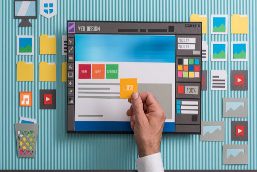
2. A Picture is worth a thousand words
It may seem cliche, but it’s true! Pictures convey a lot more information much quicker than large blocks of text. In truly effective website design, images can also be strategically placed to subtly guide users to where you want them to go. They can act as arrows pointing towards conversion points like “Shop Now” and “Contact Us” buttons.
Notice here how the arrow in the logo points directly towards the pricing option in the menu bar. Furthermore, the positioning of the man on the right side is pointed towards the lead box. These are two great examples of how visual cues on websites can guide users to primary conversion points.
When choosing images for your website, keep in mind that quality is key! All images should be high resolution and should fit the overall style of your website. It’s also a good idea to incorporate images of people as our eyes are naturally inclined to recognize faces. If you’re using stock photos, be careful not to choose ones that look too staged. This can come off as cheesy and unreputable.
When possible, replace text on your website with infographics. They are a great resource to effectively convey information while still grabbing users’ attention. The average user skims a website rather than reading it in full detail. This is why infographics may be able to convey information more effectively than standard paragraphs.
3. Aesthetics are everything
No matter how great the content on your site is, you could be losing conversions if your website isn’t visually appealing. Three of the most important aesthetic elements for effective website design are colors, typography, and balance.
As many of us know, colors elicit emotional responses. For example, warm tones like pinks and yellows make people more excited and energized while cool tones like blues, greens, and purples are more tranquil and calming. Red has even been proven to make people more hungry! That’s why so many fast food joints have red logos.
When choosing a color palette for your website, you’ll want the perfect balance of harmony and contrast. Heavily contrasting colors (like hot pink and lime green) can be jarring and distracting. It’s best to focus on hues in the same color family. Bold/bright colors are best used for call to action buttons to make them stand out, so avoid using these colors in the background of your site. Always keep your branding consistent and keep your audience in mind. Choosing colors that match your logo is a great place to start!
Just be wary of using too many different colors. Using too many different colors is one of the quickest ways to overwhelm users. It is recommended to use a maximum of five different colors for effective website design. Three or four is preferred though.
Typography has a surprising amount of power over the feel of your website. For example, ornate, cursive fonts lend an air of sophistication and seriousness while Sans Serif fonts provide a more modern, streamlined feel. There are a few font rules to keep in mind for effective website design: stick to Sans Serif fonts for body text, a maximum of three typefaces, and a font size of 12-16 pts.
Sans Serif fonts like Arial and Verdana tend to be easier to read online than Serif fonts like Courier and Garamond. That’s why they are useful for body text. More playful fonts can be used in headlines, but keep them consistent. You don’t want to use more than three different fonts across your entire website.
On the subject of text, large paragraphs can be overwhelming on a webpage. Aim for a maximum of 18 words or 50-80 characters per line and keep paragraphs short and broken up with strategic white space.
The last thing to consider when choosing the aesthetics for your website is to always keep your audience in mind. Do you want to target older people? Use larger font sizes to make the text on your site easier for them to read. When in doubt, simple designs with effective use of white space tend to be universally appealing.
Designing a well-balanced web page can be tricky, but we’re here to help! You may have heard of something called “the rule of thirds”. This is a popular principle in all types of art, and web design is no exception! The rule of thirds dictates that if you were to put a three-by-three grid over an image (or webpage) the most eye-catching points would be where the grid lines intersect. Perfect symmetry tends to actually be less visually appealing than slightly askew images that follow the rule of thirds.
4. Conventions are Cool!
People are used to certain generic website layouts. Being unique is usually a good thing, but it might be a better idea to take advantage of what users are already comfortable and familiar with! There’s no need to reinvent the wheel when it comes to effective website design.
A few examples of effective website design conventions to stick to are navigation menus at the top of each page, contact information at the bottom of each page, a clickable logo at the top of the page that will redirect back to the homepage, and a search bar at the top of the page, usually on the right-hand side. Any links should appear in a different color or should change colors when users hover over them. Also, for ecommerce sites, shopping cart icons are a recognizable feature to accompany “add to cart” or “view cart” buttons.
People are trained to look for certain buzzwords like “check out,” “add to cart,” “contact us,” and “submit”. It may be enticing to think outside of the box and use different wording, but that can actually deter some people from converting since they were in search of a more typical word. The last thing you want to do is confuse your website visitors. Avoiding fancy jargon and sticking to what people are used to leaves less room for guesswork and makes your website easier for visitors to navigate.
This website makes great use of common conventions for an extremely easy to follow web page. The logo is in the upper left-hand corner, where users are accustomed to seeing it, there is a menu bar along the top, a shopping cart icon can be clicked to view the cart, and there are clearly labeled buttons to find FAQs and to shop their products.
5. Consistency is Key
It was Lincoln Chafee who famously said, “Trust is built with consistency.” One of the easiest ways to build trust with your website visitors is to maintain consistent design elements across your website.
Some examples of effective website design by way of consistency are maintaining the same navigation or menu bar across the top of each page of your site, keeping the same color scheme and fonts across each page, and maintaining a consistent image style. If you have vector art on your homepage and lifestyle stock photos on the rest, it can come off as disjointed or confusing to visitors.
Effective website design requires one consistent motif across the entire site. Pages can have slightly different layouts to keep your website visually interesting, but they need to match. You definitely don’t want users clicking onto a new page only to wonder if they’ve clicked onto a new website entirely!
Likewise, a lack of congruence between ads, landing pages, and your website can be one of the biggest deterrents for someone turning into a customer. If someone is in the market for a new winter coat and they see an ad featuring an image of a coat they like, they will be upset if they click onto your website only to find you do not actually sell the coat from the ad.
Similarly, if your ads are eye-catching and feature a sleek, minimalistic design then people click onto a colorful, busy-looking website, they may be turned off enough to click off of your site without making a purchase. Keeping consistent themes in all your branding, including your website, is a great way to maximize conversions.
6. Let it Flow
Effective website design is about more than just looking good; the information on your website must flow in a logical and easily followed pattern. People read web pages in what is called an “E Format”. This follows the flow of most western language reading patterns. People scan sites starting at the upper left corner, then move across the page to the right, then down on the left side, and back across the page to the right one or two more times. With this format in mind, you should put the most important information on the top left corner of your site and the least important on the bottom right since that is the most frequently ignored area.
Notice how on the above webpage, the E format draws the eye across the main navigation bar, then the sub-menu bar, then the title of the first blog post. This is also sometimes referred to the F-pattern when people are scanning because as they scan, they tend to read less information across the screen to the right and tend to just scroll to read headlines down the page.
Furthermore, grid-based layouts tend to be the easiest to follow. They keep the information on your site organized in a logical pattern that doesn’t look cluttered. Even with a grid-based layout, people are turned off by large blocks of text. Instead, utilize headers, subheaders, and bullet points when possible. Keep the natural flow of the eye in mind and make sure it is easy for users to navigate your website.
Critical conversion points, like “shop now” and “contact us” buttons, should appear above the fold on your website’s homepage. This is a concept that comes from print newspapers where the most important information always appears above the physical fold on the front page. For websites, the metaphorical fold is the point at which you must scroll down to see more of the page. Users should not have to scroll to see the most important information on your site.
7. Don’t Forget About User Experience (UX)!
“Design is not just what it looks like and feels like. Design is how it works,” -Steve Jobs
The success or failure of your website hinges most heavily on usability and functionality. A beautiful website means nothing if it doesn’t have an effective user experience. When designing your website, you should always keep the user in mind and cater to their needs. Think of your website like a house. No matter how beautiful it is on the outside, you don’t want to live somewhere with shoddy construction or a confusing layout.
Some things to keep in mind for effective navigation on your website are a logical page hierarchy and clickable buttons. It should take users as little effort as possible to click onto your website and take your desired action. In fact, it is recommended that users should be able to find the information they are looking for on your website in three clicks or less.
Attention spans are short. If users can find the information they are looking for more easily on a competitor’s site, they’ll drop yours faster than a ton of bricks.
When it comes to the visual hierarchy of your website, your website should be organized so that visitors naturally gravitate towards the most important elements first. This can be done through the use of placements, sizes, and colors. For example, if you have a lead form on your website, you want every box on the form to appear above the fold and the “submit” button should be large, bright, and easy to find at the end of the form.
Take the above webpage for example. Each of the services are equally as important, so the “learn more” buttons are all the same size and color. However, the main call-to-action of the page is to learn more about one of our services, so the buttons are a bright blue that stands out from the gray background.
The best way to ensure your UX is where it needs to be is to have people test out your site. Sometimes, as a site developer, you can become blind to minor issues users may encounter when visiting your site. Enlist the help of some friends to make sure your website is easy to navigate. You should also routinely check your site to make sure all links work and everything shows up properly.
8. Keep Load Time in Mind
The days of dial-up are dead for a reason! According to eMarketer, experts used to say users would abandon a website if it took longer than eight seconds to load. That statistic has now been cut by more than half. If your website takes longer than three seconds to load, you could be losing valuable customers.
So how do you speed up a slow site? One way to improve load time is to optimize image sizes on your site. Large files take longer to load, so reducing the size and scale of some images can shorten a webpage’s load time. Making landing page redirects cacheable is another tactic that may improve your website’s load time. Already tried all these tips? It may be time to upgrade your servers.
Keep in mind that it shouldn’t take more than a few seconds for your website to load, no matter what type of device it is being accessed from. Test your site to ensure it loads quickly, not just on a desktop, but on phones and tablets, too.
9. Accessibility For All
On the subject of mobile website viewing, did you know that more than half of all websites accessed are now opened on mobile devices?
In fact according to Statista, last 2018, 52.2% of all website traffic across the globe came from mobile usage. This was an increase from 50.3% of the previous year. And what does this mean? Well, it obviously translates to more users visiting your website using their mobile phones. So, you have to ensure that your mobile website is as optimized as your desktop site.
In this day and age, your website HAS to be mobile friendly! You can create mobile versions of your website, or you can simply utilize a responsive website layout that adjusts to different screen sizes automatically.
Effective website design includes making sure your site is easily visible on all different operating systems, browsers, and devices. Flexible, responsive designs are necessary to maximize your conversions.
10. Optimization Station
As with most things in today’s digital age, the key to success in web design is constant optimization. You should consistently be testing your website to make sure it is as user-friendly as possible and effectively designed to maximize conversions.
Sometimes, it can be difficult to catch mistakes on your own website. We recommend having other people look it over including friends and professionals who can offer suggestions on how to improve your website’s user experience.
Many third-party sites also offer heat maps you can install to see which parts of your website visitors interact with the most. This will give you a good idea if people are focusing too much on unimportant details of the site and getting distracted from main conversion points.
When testing your website for optimization purposes, remember to view it from multiple different devices, browsers, and operating systems. You want to make sure your site runs properly no matter how visitors are accessing it.
Also, keep in mind that optimization is not a one and done activity. The world of web design changes constantly. You must consistently be updating your website with new information to keep it up-to-date. Have you ever clicked onto a website only to be jarred by a layout that is clearly from a decade ago? Continuously updating and optimizing your website can prevent it from succumbing to the same fate.
11. Goooooaaaaalllls!
All the other tips we’ve provided will mean nothing if your website is not centered around your goals. A specific end-goal should be at the core of any effective website design strategy.
Of course everything from aesthetics to load time has a direct impact on the likelihood of visitors interacting with your site in a way that meets your goals. The less time someone spends on your page and the less appealing your page is to them, the less likely they are to convert.
The underlying purpose of your website should be evident at all times. Be clear, upfront, and honest about what your website is all about. Don’t try to hide it or make users dig for it. For example, if you want more leads, you can have a lead form pop up right when someone first clicks onto your site.
If you’re trying to get more direct sales, make sure conversion points like “add to cart” buttons are particularly eye-catching and easy to find. All buttons on your site should be sized proportionately to their use.
So there you have it! Now you should be equipped with all the information you need to create user-friendly, conversion-driven, effective website design.
Do you need additional help designing your website? Whether you have a website that needs optimizing or you’re looking to start a new site from scratch, Power Technologies is here to help! Contact us to schedule an update or a full website redesign.